GT vs DC | 32nd Match | Indian Premier League 2024
GT vs DC | 32nd Match | Indian Premier League 2024. Gujarat Titans vs Delhi Capitals, 32nd Match – Live …
GT vs DC | 32nd Match | Indian Premier League 2024. Gujarat Titans vs Delhi Capitals, 32nd Match – Live …
Vidyasagar University PhD Admission 2023-24. 2nd NOTIFICATION FOR Ph.D PROGRAMME, 2023-24. Vidyasagar University PHD Online Application Portal. (For Fellowship holders …
SBI Youth For India Fellowship 2024-25. SBI Youth For India Fellowship Notification 2024-25. SBI Youth for India Fellowship 2024-25: Graduate …
WBPSC Recruitment 2024: Fishery Officer Posts. Public Service Commission, West Bengal, India. APPLICATIONS IN THE PRESCRIBED FORMAT ARE INVITED FOR …

RCB vs SRH | 30th Match | Indian Premier League 2024. Royal Challengers Bengaluru vs Sunrisers Hyderabad, 30th Match – …
MANUU Ph.D Admission 2024-25. Maulana Azad National Urdu University, Gachibowli – Hyderabad Ph.D Admission Notification 2024-25 Schedule for Applying Online: …
NABARD Student Internship Scheme 2024. NABARD Internship 2024-25 | Opportunity for Agri and Allied. NABARD Student Internship Scheme (SIS) 2024-25. …
KKR vs LSG | 28th Match | Indian Premier League 2024. Kolkata Knight Riders vs Lucknow Super Giants, 28th Match …
CSK vs MI | 29th Match | Indian Premier League 2024. Mumbai Indians vs Chennai Super Kings, 29th Match – …
Rabindra Bharati University Ph.D Admission 2024 Notification. PhD Admission Notification By Rabindra Bharati University. Rabindra Bharati University Admission 2024 | …
PBKS vs RR | 27th Match | Indian Premier League 2024. Punjab Kings vs Rajasthan Royals, 27th Match – Live …
University of Calcutta Ph.D. Programme Admission 2024. Advertisement for Admission to Ph.D. Programme 2024 in the Department of Chemical Engineering. …
University of Calcutta Admission 2024: Ph.D. Programme in Zoology. University of Calcutta Admission 2024 to Ph.D. Programme in Zoology. University …
University of Calcutta Scholarships/Prizes Apply. University of Calcutta Notice for Inviting Application for Various Scholarships/Prizes in the Department of Bengali …
Combined Higher Secondary (10+2) Level Examination, 2024 (To be uploaded on the website of the Commission on 08-04-2024) भारत सरकार, …
Staff Selection Commission Schedule of examinations. SSC Calendar 2024-25 Out, Check SSC Exam Dates. Scheme of Examination | Staff Selection …
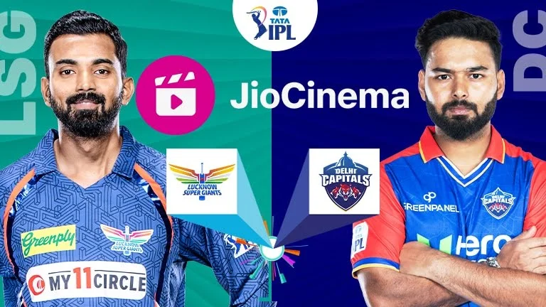
LSG Vs DC | 26th Match | Indian Premier League 2024. Lucknow Super Giants vs Delhi Capitals, 26th Match – Live …

National Law University Recruitment 2024 – Apply for Consultant Vacancy. National Law University (NLU) ** Note: Please note that applicants …
SSC CHSL Recruitment 2024: CHSL Exam, Online Apply For 3712 Vacancy. SSC CHSL Notification 2024 Released for 3712 Vacancies, Registration …
Assam University Silchar Recruitment 2024 – Apply for Junior Research Fellow (JRF) Vacancy. Assam University Silchar Recruitment 2024 Applications are …
UniCreds Scholarship 2024: Fly High Scholarship Program. All about UniCreds’ ₹50 lakh Fly High Scholarship. UniCreds Scholarship 2024: Fly High …
UPSC Recruitment 2024: UPSC CSE 2024 Vacancy, Apply Online, Eligibility, Fee. Union Public Service Commission (UPSC) EXAMINATION NOTICE NO.07/2024-IES/188 DATED: …
RNLKWC Admission 2024: Ph.D. Admission Notification for the Session 2023-2024. Raja N. L. Khan Women’s College (Autonomous) Raja N. L. …
MI vs RCB | 25th Match | Indian Premier League 2024. Mumbai Indians vs Royal Challengers Bangalore, 25th Match – …

RR vs GT | 24th Match | Indian Premier League 2024. Rajasthan Royals vs Gujarat Titans, 24th Match – Live …

PBKS vs SRH | 23rd Match | Indian Premier League 2024. Punjab Kings vs Sunrisers Hyderabad, 23rd Match – Live …
TATA IPL 2024 Match 21 LSG vs GT Match Report. LSG vs GT Highlights, IPL 2024: Yash Thakur’s five wicket. …

CSK vs KKR | 22nd Match | Indian Premier League 2024. Chennai Super Kings vs Kolkata Knight Riders, 22nd Match …
UDD Delhi Jal Board Recruitment 2024: Delhi Jal Board Junior Assistant Recruitment 2024: Applications Invited To Fill 760 Vacancies. Delhi …
Gujarat Police Recruitment 2024: Applications Invited For 12,472 Posts, Check Details. Gujarat Police Recruitment 2024: The registration process began on …